Chosen questions from the exam: Places and Spaces
Places and spaces represents a very broad topic. We are surrounded constantly by places and spaces, and they have been photographic subjects since the invention of the camera. Across the disciplines of street and architecture photography, photographers have photographed places, with differing intents and purposes, ranging from the sweeping landscapes of Ansel Adams to the emptied interiors of Candida Höfer
As this is a very broad topic, I started off with a mindmap of some of my initial ideas of how to approach the question.
As this is a very broad topic, I started off with a mindmap of some of my initial ideas of how to approach the question.
I then looked at various artists. I chose 3 of the artists who were provided in the assessment paper, and 1 of my own as a starting point (see mindmap). I particularly leaned more towards the architectural aspects of 'places and spaces', as architecture photography is one of my favourite genres, and one I have a lot of experience with. I also saw many of these artists at the tate modern in 2023
Sebastian Weiss

|
|
One of the first artists I chose was Sebastian Weiss. Sebastian Weiss is an architecture photography from Hamburg, Germany whose work focuses on the geometric patterns and structures of modernist architecture, the architecture of concrete popular around the mid 20th century. In his words, he is 'passionate about concrete'.
His work often focuses on the geometry of architecture, and often displays only parts of rather than whole buildings. He uses leading lines and clear, uncluttered compositions to reveal the geometric nature of modernist buildings, creating a serene, harmonious impression of clean geometry. His pictures are also devoid of people, emphasising the expansive, precise, geometric nature of his compositions. He makes use of strong lighting, as his photos are taken towards the middle of the day, when the strong shadows provide clear, geometric lines which accentuate the geometry of the architecture, and the bright sunlight emphasises the colour and contrast of the image.
In response to his work, I planned to take photos of the Tate modern during sunset and immediately before, focusing on the geometry of the building, and the shadows drawn on its surface by the light of the setting sun.
My Response to Sebastian Weiss


I took my initial photos in response to the work of Sebastian Weiss on the 19th of January, going to the Blavatnik building of the Tate modern, on the south bank. My photos were focused on the geometry of the building, which I noticed to be a recurring theme in his work. In particular, I focused on the strange geometric shapes of the building's concrete interior, which I felt would be similar in subject matter to the work of Sebastian Weiss, which also focuses on geometric shapes and modernist architecture.
However, I noticed in my photos that while I had gotten many of the key ideas of his work correct, the aspect ratios were incorrect, leading to me cropping 3 images, as well as adjusting colours and tones in photoshop:
However, I noticed in my photos that while I had gotten many of the key ideas of his work correct, the aspect ratios were incorrect, leading to me cropping 3 images, as well as adjusting colours and tones in photoshop:

|

|

|
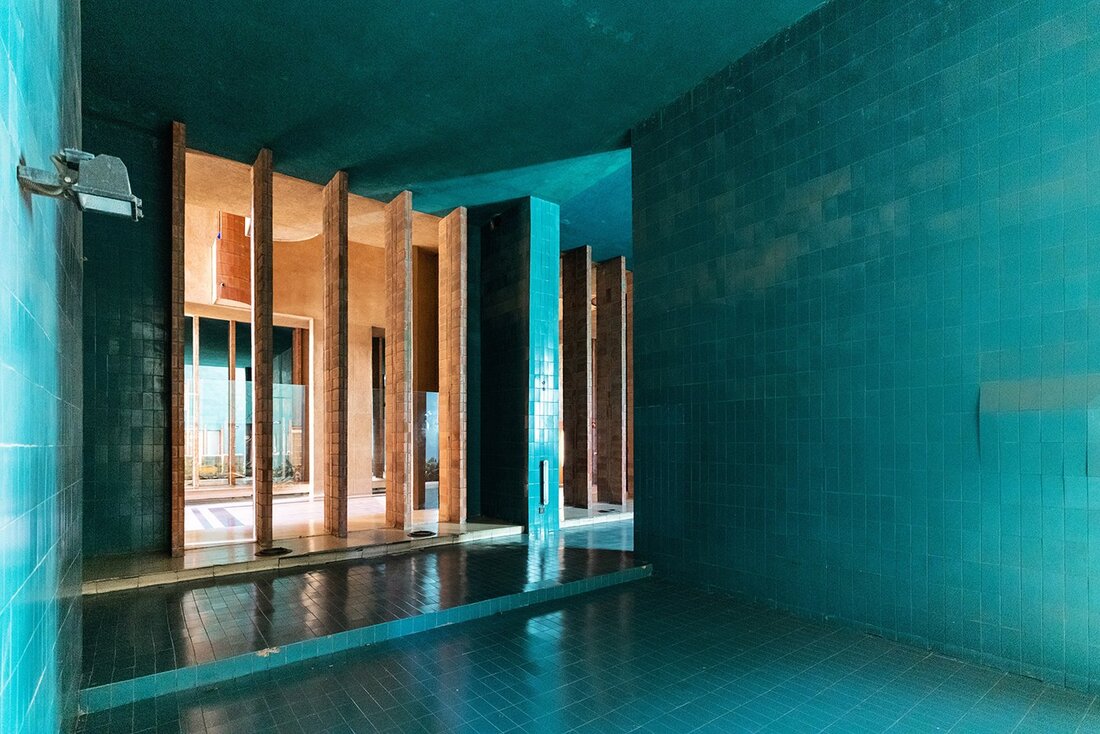
Of these photographs, my favourite is the central image, of the stairwell of the Blavatnik building. I really like the geometric shapes and clean lines of the image, which divide the image into multiple triangles and the semicircle of the stairwell. I also am quite happy with the way the strong lines of the shadows on the wall divide it into triangular sections which emanate frrom a single point. The oicture also has strong leading lines, such as the roof overhang, which leads into the photo from the edge.
I also really like the colours. In particular, the contrast between the warm, saturated red and orange rust on the foreground wall with the industrial, cold blue of the frosted glass in the background is very effective in my opinion, as it makes the geometry of the wall and stairwell stand out from their background.
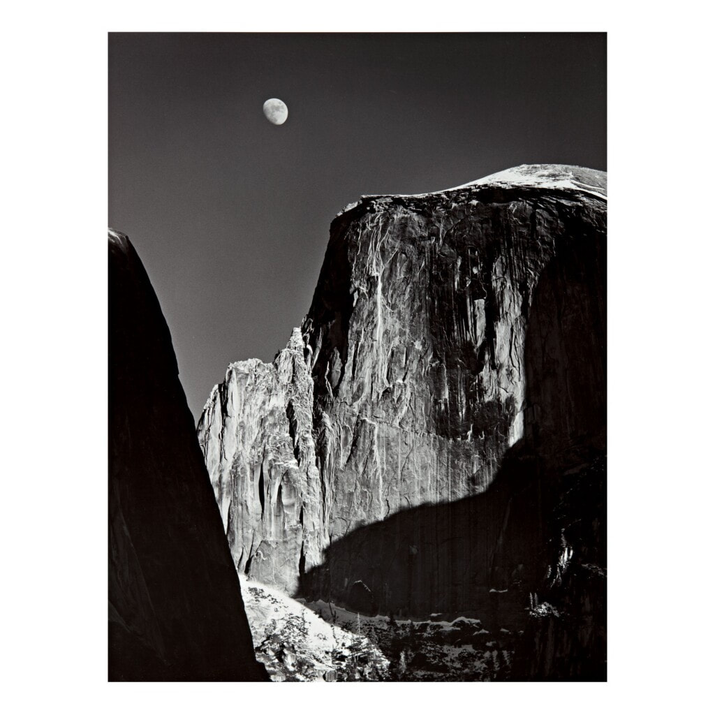
While I also like the exterior pictures, I feel they would benefit from being taken earlier in the day, perhaps around 16:00. During this time, the light is coming from the side, and the long shadows produced would cause the texture and form of the building to stand out in the pciture. My photographs were taken later - the lighting is therefore flatter, and gives a more 1-dimensional effect. I do however love the moon in the photos, especially the rightmost where the moon rises dramatically over the building as if it were a mountain. The effect of this is almost like a landscape photograph. I immediately thought it almost reminded me of this photograph by Ansel Adams:
I also really like the colours. In particular, the contrast between the warm, saturated red and orange rust on the foreground wall with the industrial, cold blue of the frosted glass in the background is very effective in my opinion, as it makes the geometry of the wall and stairwell stand out from their background.
While I also like the exterior pictures, I feel they would benefit from being taken earlier in the day, perhaps around 16:00. During this time, the light is coming from the side, and the long shadows produced would cause the texture and form of the building to stand out in the pciture. My photographs were taken later - the lighting is therefore flatter, and gives a more 1-dimensional effect. I do however love the moon in the photos, especially the rightmost where the moon rises dramatically over the building as if it were a mountain. The effect of this is almost like a landscape photograph. I immediately thought it almost reminded me of this photograph by Ansel Adams:
|

|
I was pleasantly surprised by how landscape-esque my photo looked! I didn't know it would end up looking like this
I also like the leftmost picture: taken right at the end of sunset, the vivid red of the building stands out from the cool blue hue of the surrounding sky. However, I feel like had I framed it better, so that the diagonal would extend from corner-to corner, the resulting effect would be more importantly. Also, had I taken it from a slightly different perspective, the photo would no include the facade of the building in shadow, creating an even starker contrast between the sky and the building.
Editing the photos-Response to Sebastian Weiss
In order to more effectively emulate the visual language of Weiss' photography, I edited the pictures I had taken using photoshop. In [particular, I noticed 2 things which separated my photos from those of Weiss from mine (aside from my obvious issues composing half-decent pictures)
1)Aspect Ratio- Weiss's Pictures tend to have very short, squat aspect ratios, typically anywhere from 4:3 to square in format. This is not the native aspect ratio of my camera, however it is often preferred by artists as there is less 'wasted space' in the horizontal axis than in the 35mm film ratio of 3:2.
2)Colour & tones- while not always apparent, the tones in Weiss's work are richly saturated, making shapes and lines stand out from the background, which is accentuated by the sunlight in the pictures. The tonality of the pictures, while not overtly so has fairly high contrast, which divides images into areas of vivid light and deep shadow. This is probably also accentuated by the sunlight, however thanks to the time of day and London's notorious weather, I was forced to improvise.
I therefore edited my pictures in photoshop to bring out the colours and contrast:
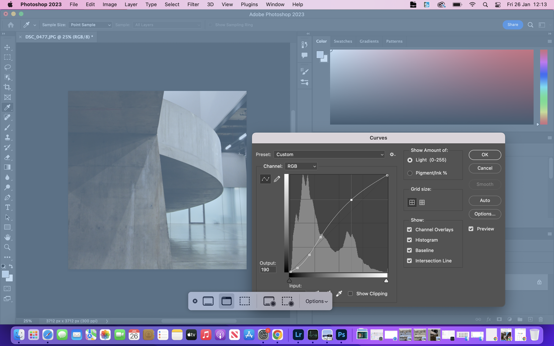
Editing the stairwell photo: the S-shaped curve exaggerates the contrast of the picture. I attempted to be subtle: I did not wish for my image to appear artificial
In this photo, the photo has already been cropped to a square aspect ratio: I did this so that the line of the overhang would guide the viewer into the frame, and towards the centre. The effect is emphasised by the lines of the shadows, which lead the viewer to the centre point where they converge: it almost resembles a clock. Increasing the contrast also emphasised this effect, giving the image a near-sculptural, geometric quality.
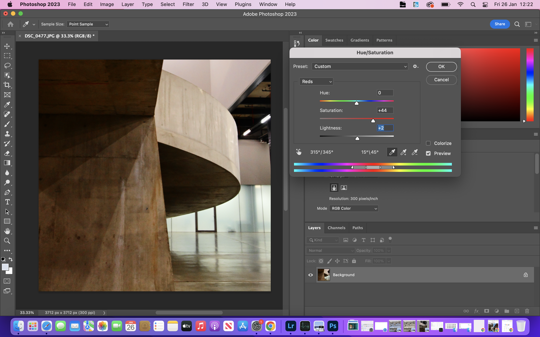
I increased the saturation of reds in my photograph, to emphasise the rust streaks on the walls. The streaks reflect the history of the building: this lower storey was actually used to house water tanks and cooling machinery from when the Tate modern building was the Bankside power station: the contact of wet metal with the walls caused the rust to stain the grey concrete.
I then edited the colouration of my photograph, to better reflect the bold, punchy tones of Weiss's work, by increasing colour saturation, especially of the colour red. The colour red is particularly important to this photo, as the red rust streaks are one of the vestiges of the building's previous use, which stain some walls. While many of the interior walls are new, dating to the buildings use as an art gallery, some are remnants from the cooling when the building was still the Bankside power station. When I was in the building, I noticed this and found it immediately interesting: I therefore decided that it should be emphasised in the photograph.
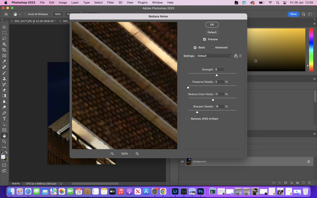
One technical challenge I had when editing was image noise: Both the exterior were dimly lit due to the late time of day, meaning the camera used very high sensitivities (ISO 25600!). This meant that the images turned out fairly noisy, although quite good considering how dark it was. I therefore, had to use photoshop's noise reduction tool to reduce the fairly ugly image noise, although I had to be careful not to overdo it, to avoid image artefacts and loss of detail from occurring.
If I were to repeat this, I would have used a tripod for the exterior shots. While I had one with me, I idiotically forgot the tripod mounting plate for the camera, making this unusable. I then could have used a lower ISO and a longer exposure, increasing the detail and overall quality of my images.
If I were to repeat this, I would have used a tripod for the exterior shots. While I had one with me, I idiotically forgot the tripod mounting plate for the camera, making this unusable. I then could have used a lower ISO and a longer exposure, increasing the detail and overall quality of my images.
Developing my Ideas:
In order to further develop my ideas, I decided that I will continue responding to Weiss's work, focusing on other examples of modernist architecture in London.
One of London's most notable examples of modernist architecture is the Barbican complex, a postwar housing development risen out of the ruins of the Blitz, which destroyed much of East London and the city from 1940-1941. The development was designed by architects Chamberlin, Powell and Bon, envisaged originally as a housing estate for London professionals, situated close to the city's financial hub. The estate is grade-II listed, and seen as an icon of London, and emblematic of the postwar era.
I also did some research, and am planning to expand my current work with pictures of modern architecture from across London. I will use the half term to do so, hoping that the weather is conducive. For these pictures, I plan to arrive earlier, ideally an hour before sunset so that the shadows can emphasise the geometry of the architecture. Furthermore, doing so will give me a broad range of varying lighting conditions as the sun sets.
My Photographs:
Unfortunately, I must have made a mistake when uploading my photographs with onedrive, as half the images seemed to have mysteriously disappeared from the folder. These included all the images before and during sunset, leaving me with just the photographs from after sunset. As a result the lighting is rather flat, although as the day was overcast for substantial periods of time this was also a problem with my images beforehand:


Luckily, I did find the missing photos. Overall, I am really happy with the photographs, especially the top left and bottom left. In particular, I particularly like the sweeping line of the lower buildings in the bottom left image, which guides the viewer upwards and through the image. I also really like the reflections in the top left image, although I should have been more careful not to burn out the highlights in the background. In particular, my opinion of these photographs was substantially elevated once I had edited to photographs, the increased contrast and cropped compositions were in my opinion better, and I was positively surprised, as my photos had shifted from merely mediocre to some of my favourite images.
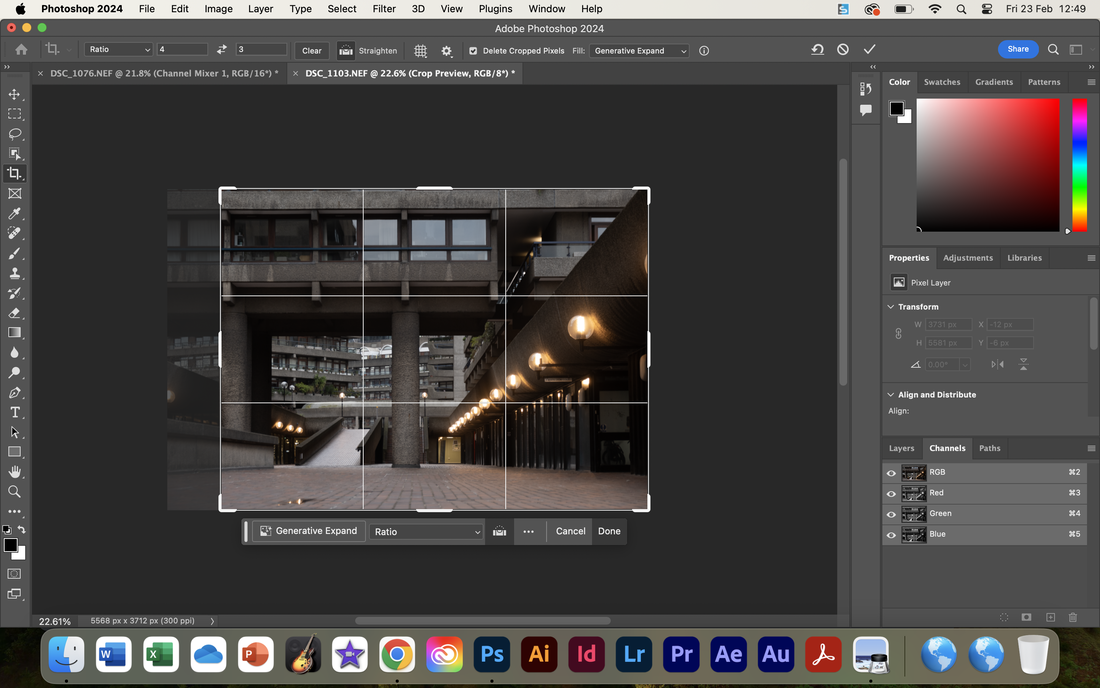
I edited these photos in a similar fashion to the Tate pictures, but I think this time the images were more successful. While bad, the lighting was still at least better than at the tate, and my pictures had less image noise. Cropping was important, partly to accentuate the leading lines and balance the composition, partly to emulate Sebastian Weiss.
I edited these photos in a similar fashion to the Tate pictures, but I think this time the images were more successful. While bad, the lighting was still at least better than at the tate, and my pictures had less image noise. Cropping was important, partly to accentuate the leading lines and balance the composition, partly to emulate Sebastian Weiss.
Barbican II during post-processing. Note the removal of the unnecessary negative space on the left-hand side of the image to create a more impactful composition, and enhance the geometry of the architecture
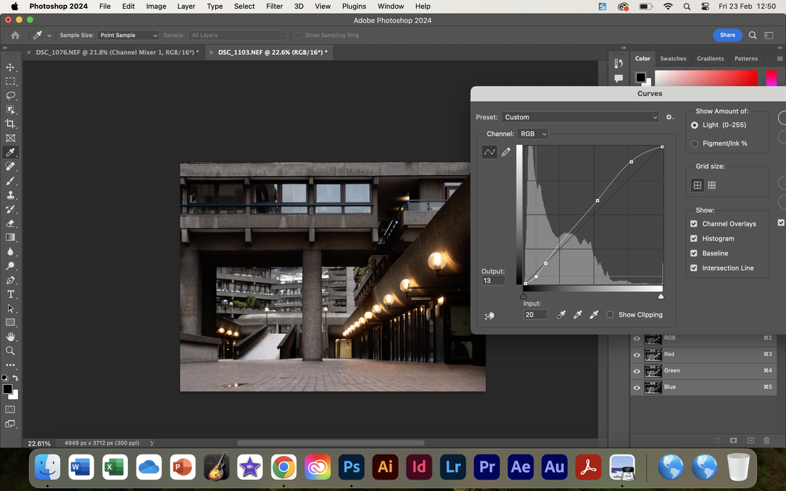
Another step in the making of Barbican II. Note the changed curve, to brighten the upper-mids and highlights in what would otherwise be a very very dark, heavy image. The shadows have been darkened slightly to enhance the stark lines of the architecture. The images were all taken on a cloudy day, meaning the contrast would otherwise be very poor.


a simple comparison of the changes I made to each image. The edited images are on the left, whereas the unedited images are on the right hand side.
Next Steps?
As a whole, I was very happy with the photographs I created. Therefore, I would like to pursue similar ideas to these going forwards. In particular, I would like to continue exploring the geometry of modernist architecture, which I found very interesting to photograph. To further refine my ideas, and work I would like to explore an idea I was working on previously as part of my Component 1 constructed landscapes work.
A notable photographer who has also photographed architecture, and whose work I have been inspired by is Andreas Gursky. In Constructed Landscapes, I made 2 composited photographs using his technique, of the Millennium bridge and Blackfriars bridge.
Gursky's photographs are made of multiple images stitched together, creating the impression of one photograph of a near limitless resolution. This allows for highly detailed, extremely detailed images, which create an impression of vast scale and monumental grandeur.
However, I ultimately feel I do not have the time to achieve this, as revision for the GCSEs, and the volume of images I will need to produce makes this unfeasible.
The National Theatre
For future photos for my assessment, I plan to take pictures in the style of the photographs I created at the Barbican: I also plan to continue focusing on modernist/brutalist architecture in London. I therefore decided next to take photographs of the National Theatre, another of London's postwar era landmarks. The National theatre is a brutalist landmark, which was built in 1976, the same year that the barbican was completed, making it a contemporary of the Barbican. Therefore, while designed by different architects they share many similarities.


Overall, I am very happy with the way these photos have turned out. I really like the top left picture- the punchy, vivid yellows and reds make it stand out- I also like how the yellow stairwell is balanced by the red of the framework of the building. I enhanced these colours in photoshop to bring out this further. I also really like the top right, where the signs lead the viewer out of the photo: they also provide context, emphasising the location of the image. I had to photoshop an entire crane out of the image, as I found the crane piercing through the roof of the building to be very distracting. I also edited out some people from this and the bottom-left image.
My favourite, however may be the bottom right. I really like the symmetry, and I feel the low perspective emphasises the stark, angular architecture of the National Theatre. It is almost reminiscent of the towering bridge of a battleship, with a very fortified appearance. I also really like the clear detail in the concrete, which I emphasised by adjusting curves in the image.
My favourite, however may be the bottom right. I really like the symmetry, and I feel the low perspective emphasises the stark, angular architecture of the National Theatre. It is almost reminiscent of the towering bridge of a battleship, with a very fortified appearance. I also really like the clear detail in the concrete, which I emphasised by adjusting curves in the image.


removing the base of the crane using the patch tool
To remove the crane, I first used the healing brush to remove the main component of the crane. However, for the base instead I manually replaced the base using the patch tool, ensuring a neater result. I also used the healing brush to remove people from my images. Sebastian Weiss' pictures whose work this is partly inspired by often lack people. The only exemption to this general rule was the bottom left image. Removing the people on the balcony would likely have been very difficult due to the perspective, and also the sheer amount of people. However, the man walking down the path was retained intentionally, as I believe the addition of a person enhances the composition, especially as they are walking into the centre of the photo, which strengthens the effect of the leading lines.


removing a person using photoshop's heal brush feature
Overall, I found this to be very effective. I was able to remove a lot of clutter and unnecessary details from my photos, causing stronger compositions.
Tate Modern - Revisited
I had taken photographs of the tate modern before as part of my project. However, these did not fully meet my expectations, and I was somewhat unimpressed with these compared to my other photographs. Additionally, these were taken at night/late evening, meaning they contrast visually with the other pictures, a problem when displaying them together.
I also wanted to photograph the building from different perspectives, taking advantage of the strong shadows and abundant natural light present in the building during the day to emphasise the geometry of the architecture:
I also wanted to photograph the building from different perspectives, taking advantage of the strong shadows and abundant natural light present in the building during the day to emphasise the geometry of the architecture:


12 of the photographs I took when I was at the Tate. I attempted to photograph the building from a variety of different perspectives, focusing particularly on the Blavatnik building
I then edited 6 of these to make these:


In these photographs, I also took pictures of the turbine hall (middle top and bottom and bottom right), drawing emphasis to the steel beams which characterise this space in the building. I wanted these pictures to convey the industrial nature of the building, having been built as a power station, and how this contrasts with its current role as an art gallery. This is especially visible in the bottom right images, where the hook of a crane hangs forgotten from a gantry on the ceiling of the building. The industrial, unpolished, stark beams contrast with the newer pastel-blue rectangle of the balcony, which the eye is drawn to by the lighting.
Ultimately, I am very happy with this latest set of images, which present a variety of different views of the Tate Modern. I feel that these images are of a substantially higher quality than the photographs of the same building I took in January, which is reflective of my photography improving over the last 3 months.
Additionally, I feel that the better lighting conditions has improved the image quality as the images have less noise and processing artefacts than my pervious images. The lighting also improves the colour and contrast of the images, which additionally meant that editing these pictures was somewhat easier than with the previous images I have taken, which required large amount of editing to meet my expectations.
Using Photoshop's adaptive wide angle feature: note the curved edges of the image from correcting lens distortion
For these photos, I experimented with new photoshop methods to improve the visual quality of my images. For example, I used the adaptive wide angle to remove distortion from my images and straighten lines. This enabled me to increase the visual quality of my work. By straightening lines and makin images more vertical, I increased the visual impact of my compositions.
the impact of Adaptive wide angle: the original image (left) vs the edited image (right)
Planning for the Making Day
For the making Day, I decided that I would work on producing a photobook of my images:
I settled on the idea for a number of reasons:
I settled on the idea for a number of reasons:
- it would allow my photographs to be displayed at large sizes and allow the reader to compare/contrast the images.
- I think my photographs have a relatively consistent visual language in terms of composition, meaning they could work well displayed together
